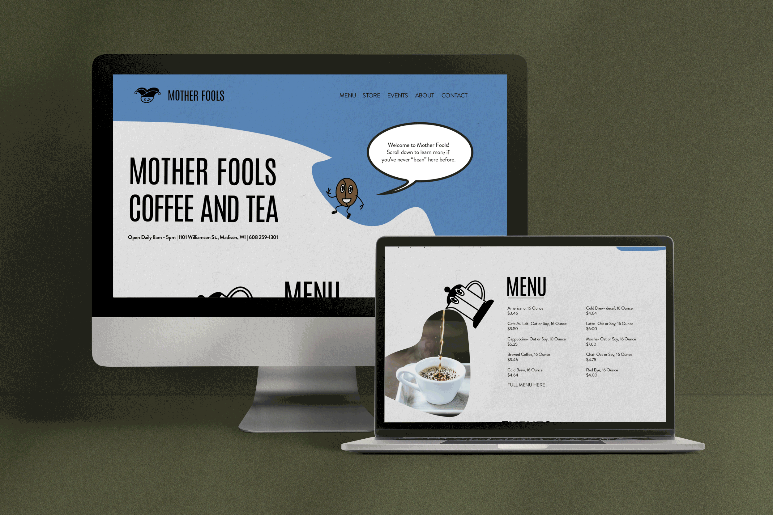
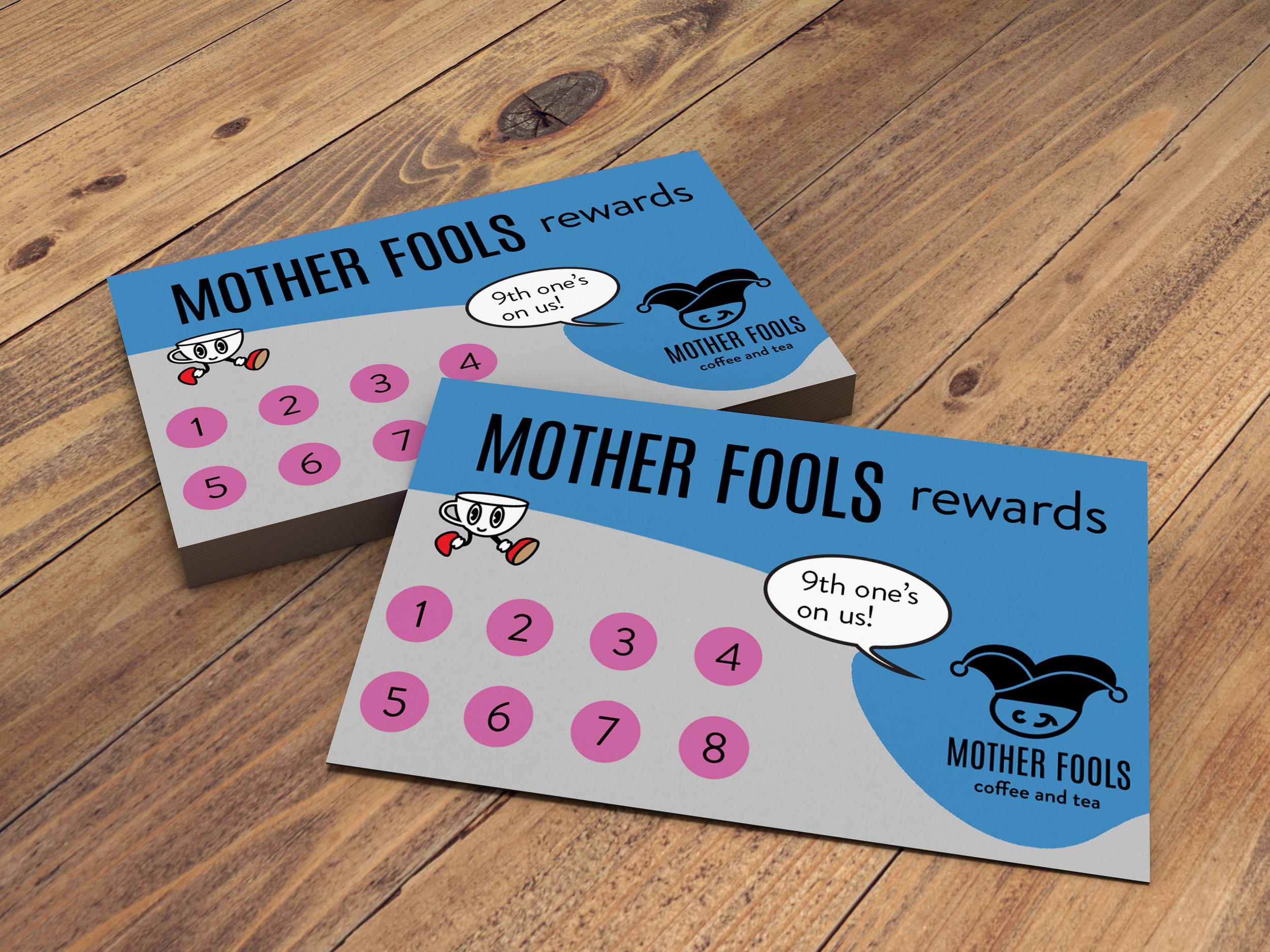
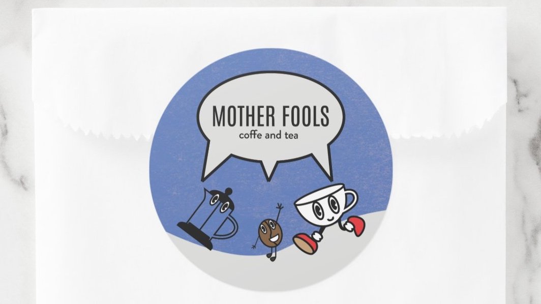
Mother Fools Rebranding
This complete rebrand for local coffee and tea shop, Mother Fools, was an exciting challenge. My personal goal for this rebrand was to match the aesthetic of their brand persona with the energy and attitude of the shop itself. I wrote all the copy for this site, as I wanted to showcase the importance of brand language consistency. The language matches the fun and colorful characters, and organic shapes inspired by coffee/tea spills throughout enforce the playful and light atmosphere that Mother Fools is best known for.