Business Card Process
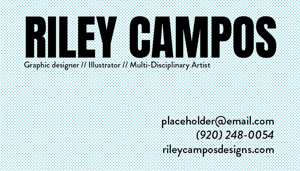
When it came time to make business cards, I knew I wanted to do something that celebrated my love for printing and cartoons. I initially went for a CMYK color scheme with halftones.
First draft business card (front and back)

ROUND 2
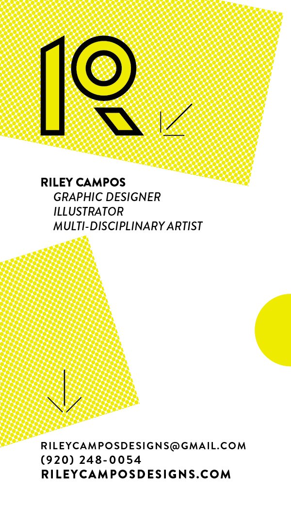
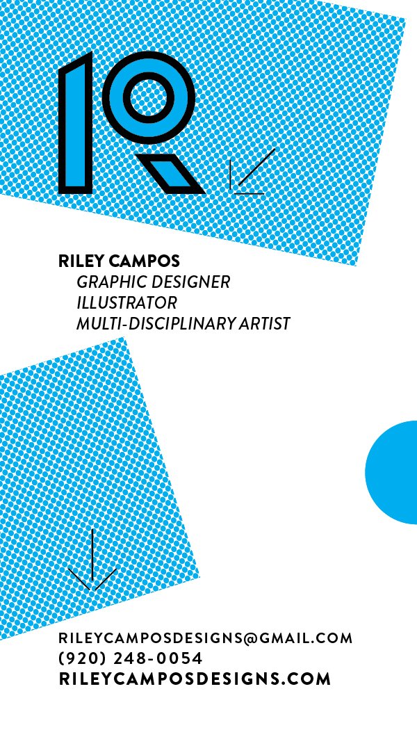
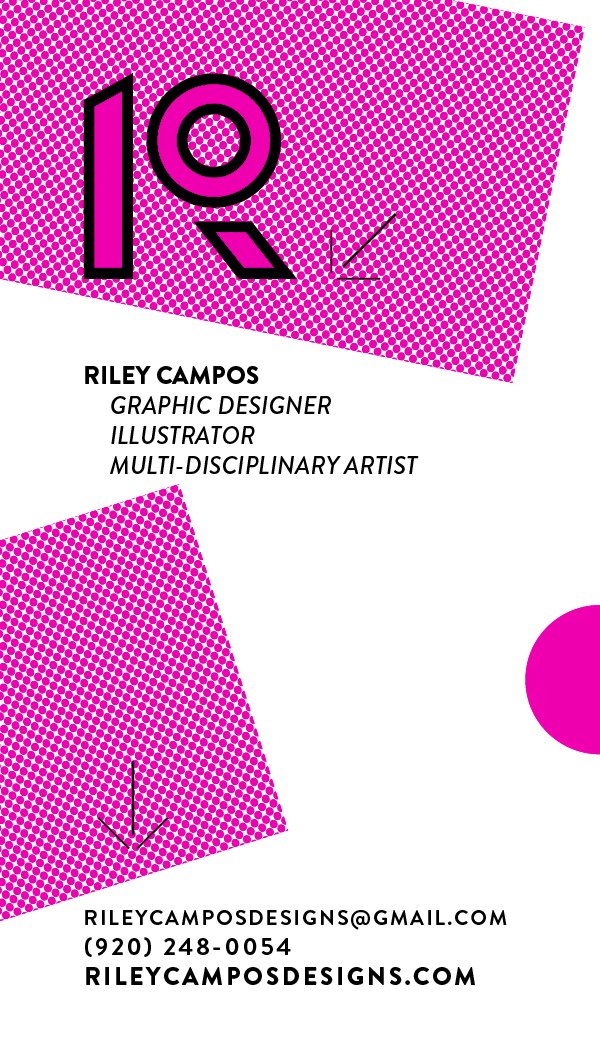
After a round of critique, it ended up somewhere around here. Keeping with the CMYK color scheme and half tones, making the card vertical and one-sided, and adding in some breathing room and arrows to call attention to the text and reference crop marks to push home the concept of this being a card for someone who loves printing. The project would have been expanded to have three sets of cards: one with yellow and black ink, one with cyan and black ink, and one with magenta and black ink. Due to time restraints, the design was stripped down to a two color job with cyan and black.
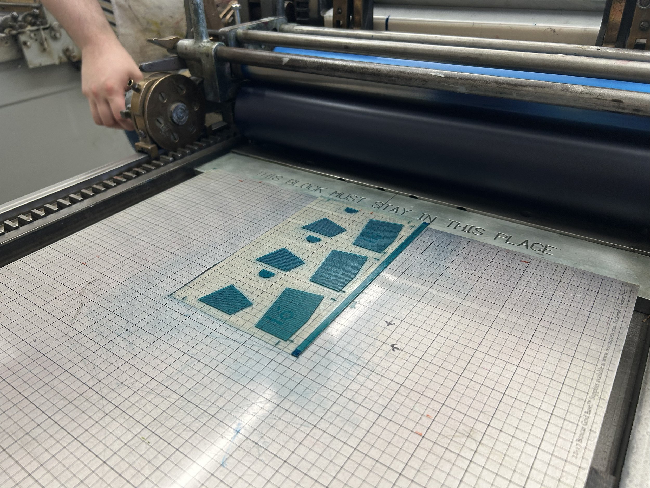
Letterpress printing
This print job had some limitations, as the only paper that was available and was the right thickness/color was pre-cut pretty small, hence the smaller printable area. However, that wasn’t enough of a deterrent to stop me from getting a good workout on the letterpress machine!


Final design

