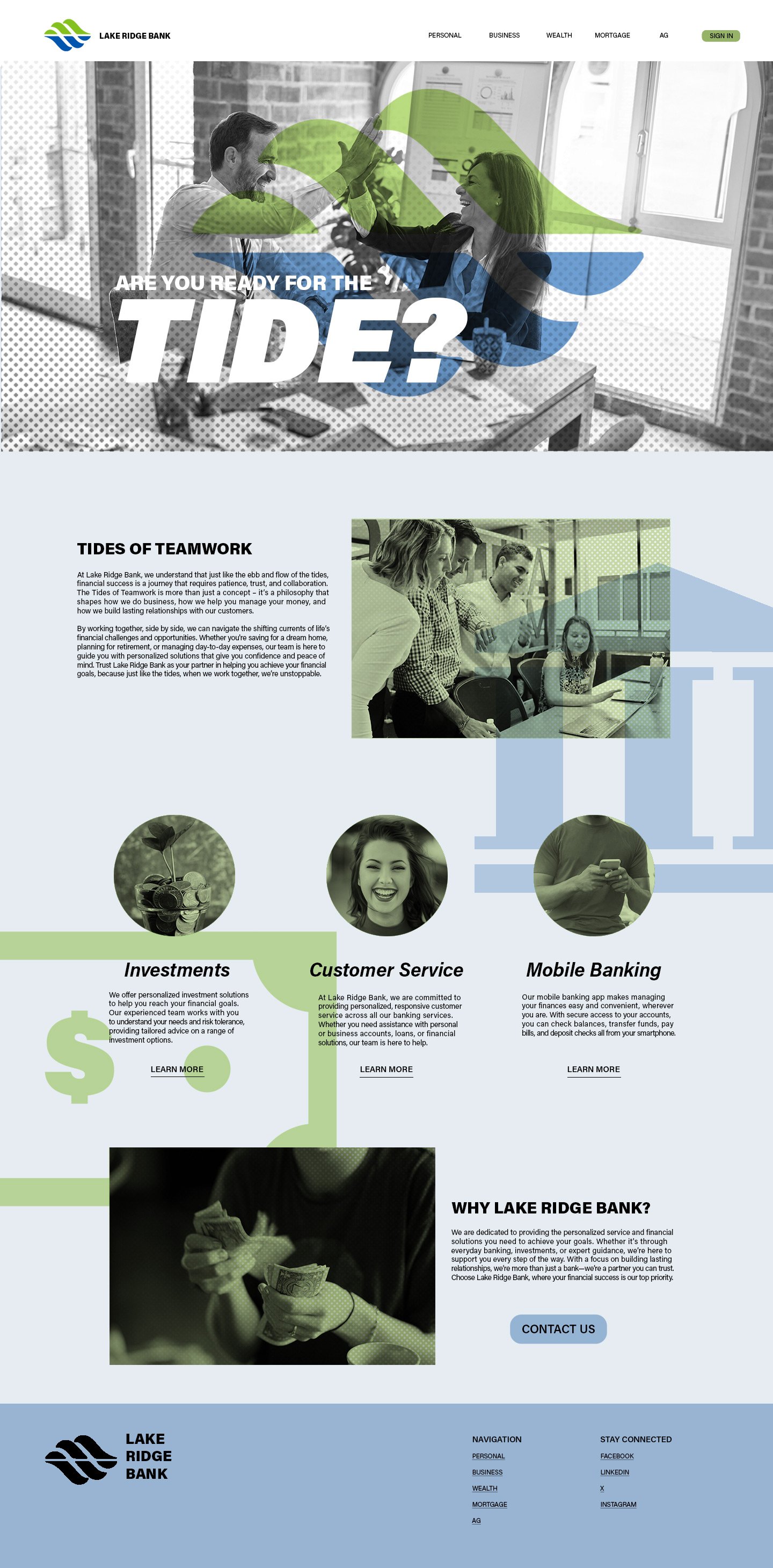
Lake Ridge Bank Responsive Site
The challenge of updating any aesthetic aspect of a business comes with the responsibility of staying true to what the business stands for in the first place. Lake Ridge Bank commits to local community, and I wanted to highlight that in the approach to this concept. Tides of Teamwork not only encapsulates Lake Ridge Bank’s philosophy of togetherness, but also the ebb and flow of financial success. Visually, I stuck with the original color scheme of the logo, and gave a duotone image treatment with halftone texture, to subtly remind the viewer of the texture and color of a dollar bill. This project entailed one desktop site, one tablet site, and one mobile site.


